Why Not Both
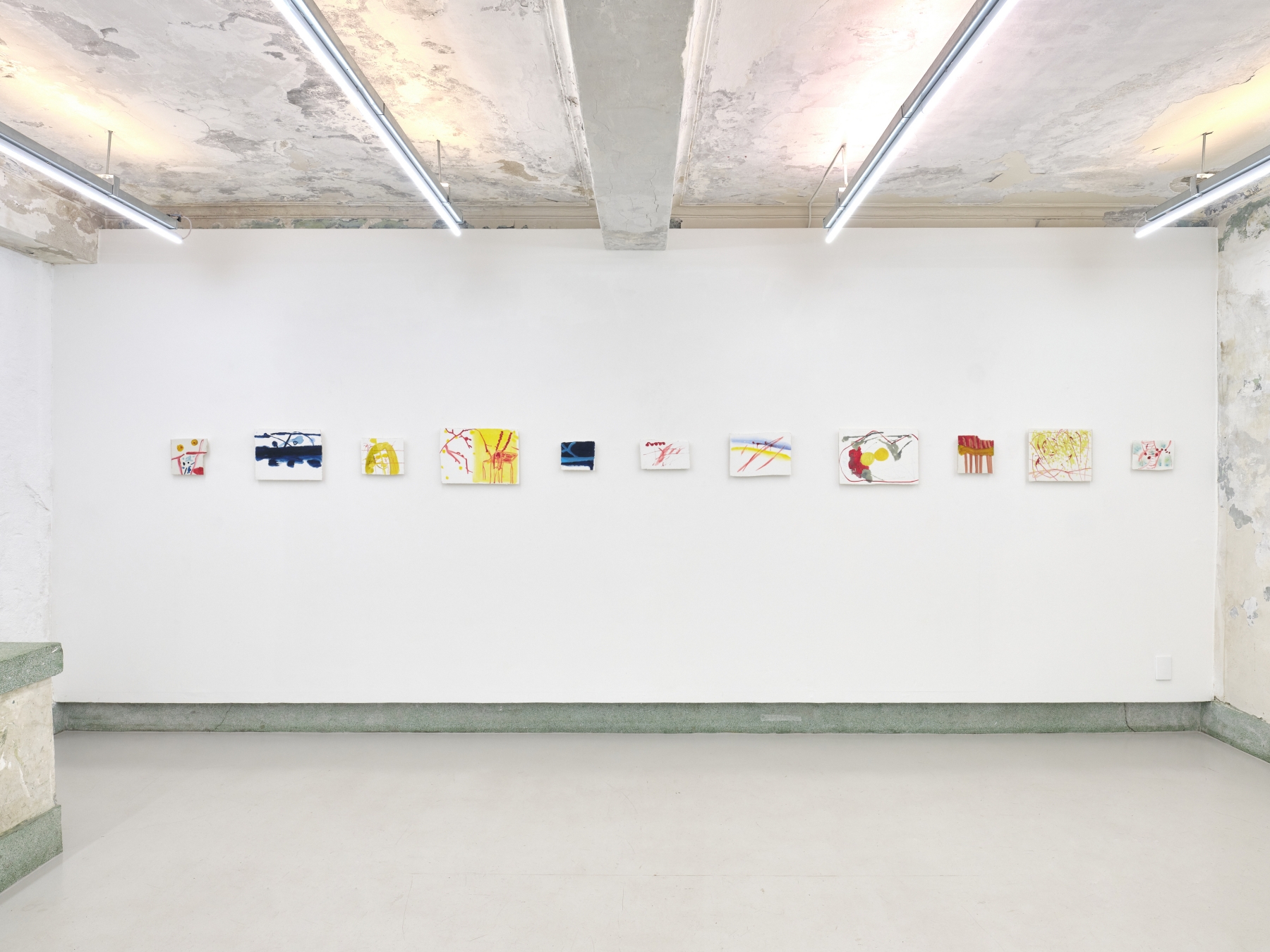
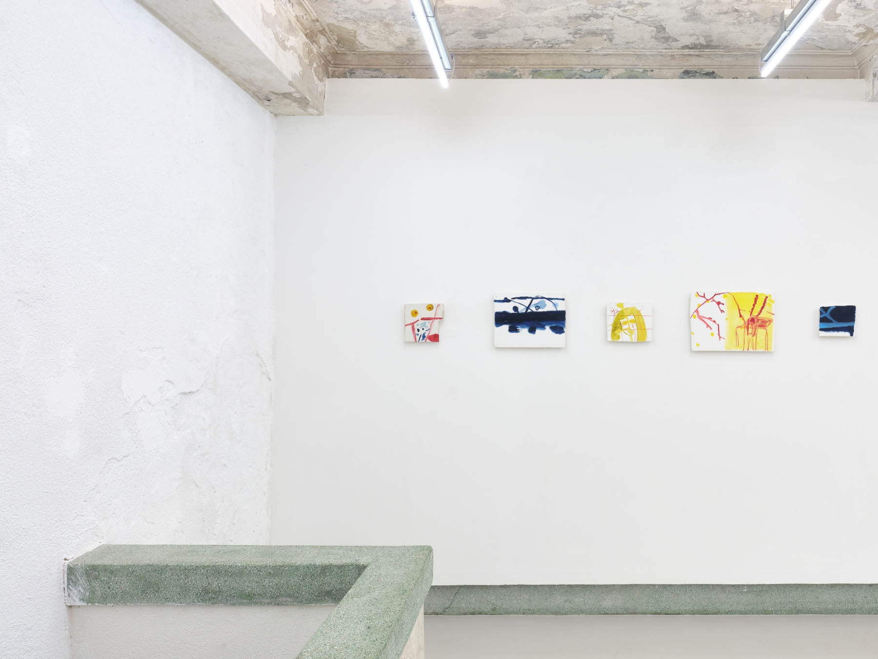
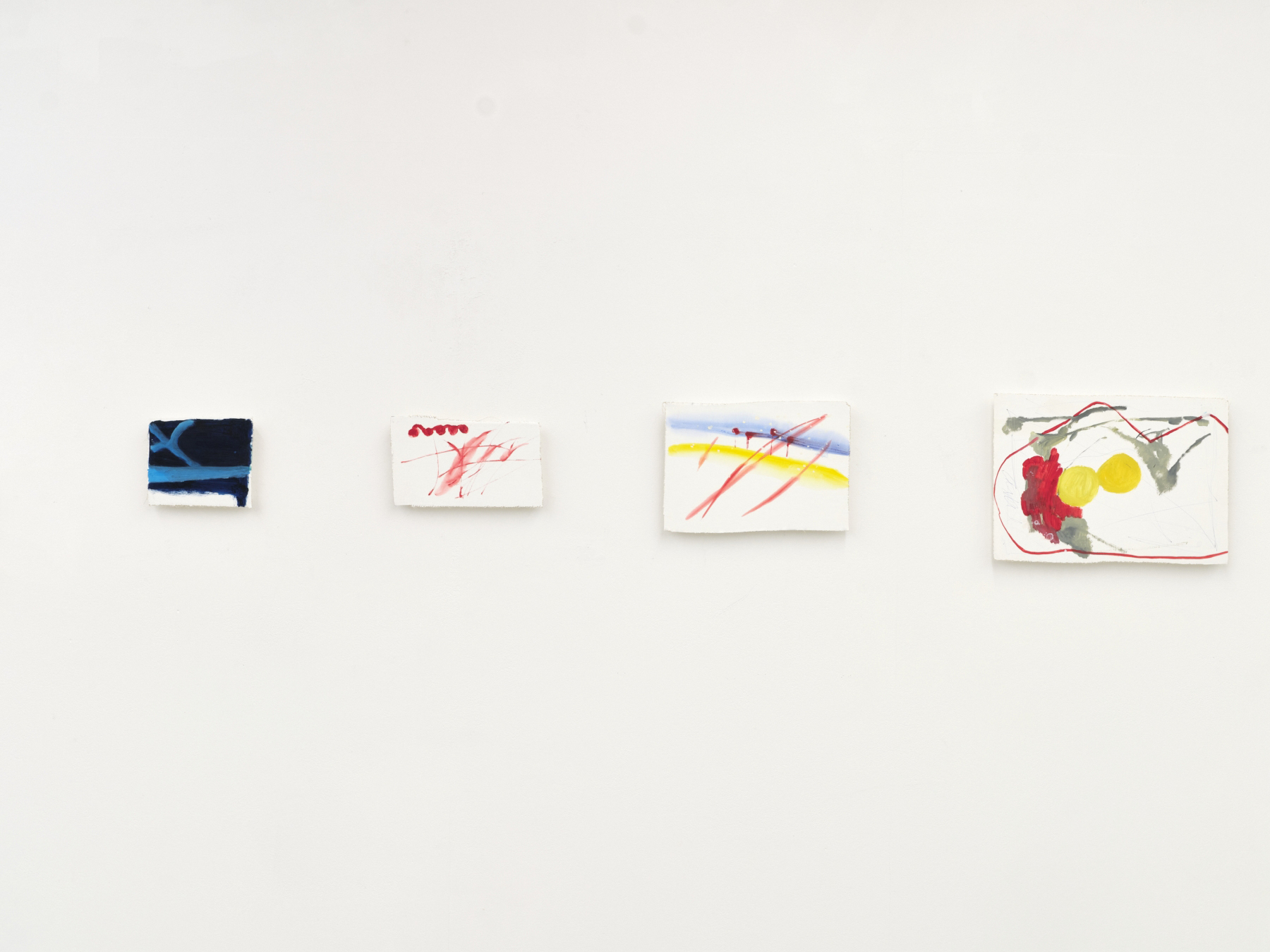
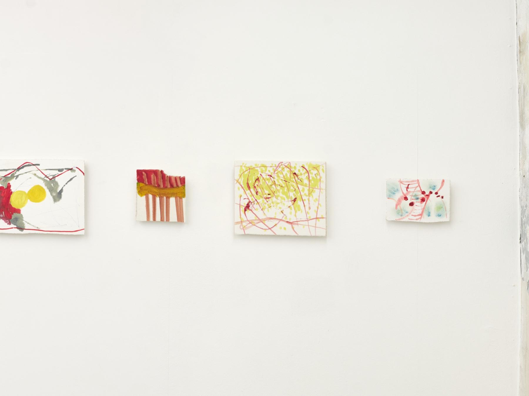
Text. Martin HerbertMaybe we need more names for things, or perhaps it’s better that some things stay unnamed, since our existing words don’t fit them. Choon Mi Kim’s drawings, for instance: or ‘drawings’, or something else. Gener- ally, when a painter makes a drawing, it exists in a subordinate realm to their canvases, their ‘real’ art. A drawing is preparatory, often, and not only smaller and quicker and less thought-out but typically more fragile. Kim’s drawings mostly don’t function like that; and if you can’t pin them down in formal terms, that’s not the only way they dance and weave stylishly around definitions.
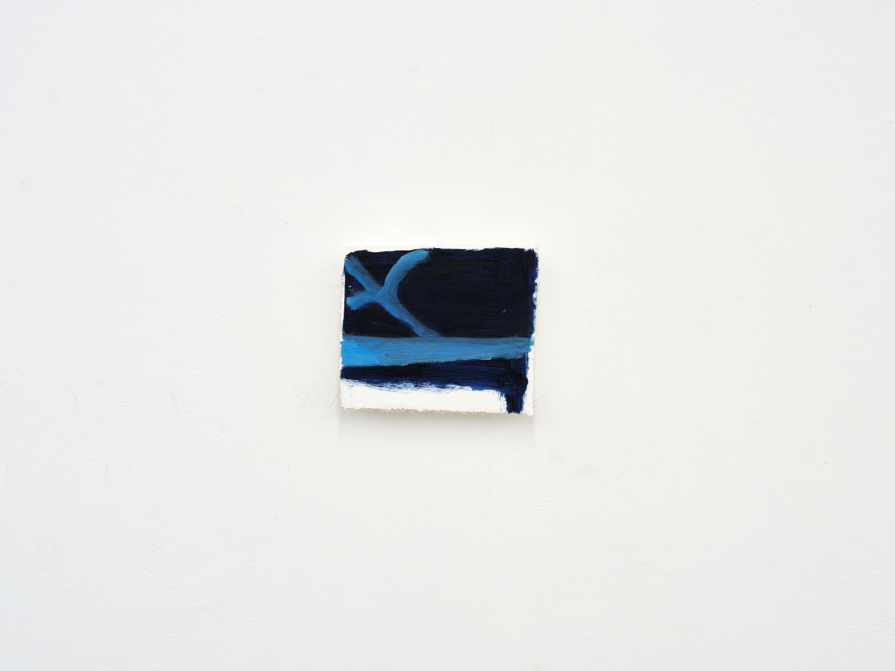
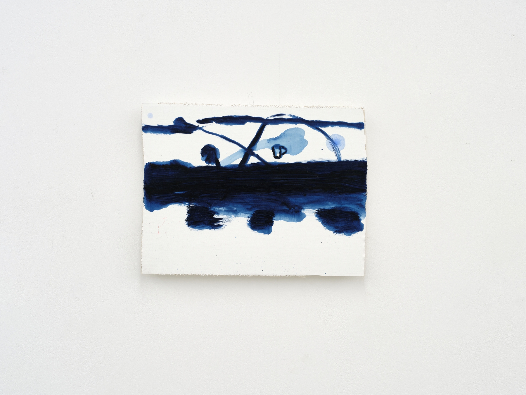
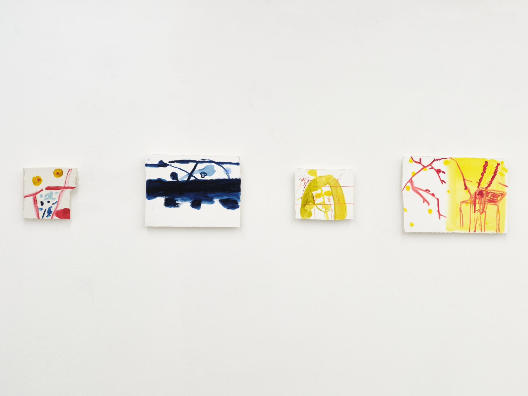
Take An Open Bag of Crisps (2024) and start with the fact that its support is canvas, not paper. This places it immediately in a hazy mediu- mistic interzone: canvas signifies painting, and this work is indeed painted, but the canvas is an offcut, a waste-not scrap, which reroutes that reading back towards tentativeness. The work thus quivers already, quietly, in a halfway place between casual draft and completed state- ment. It’s not telling you how seriously to take it. OK, and then what are we looking at, or reminded of? First thoughts, parsing the painting’s deep and lighter blues, are possibly of a nocturne, a seascape and/or landscape in the midnight-blue (and Kim has, indeed, previously said that one thing she’s inspired by is the sea near where her family lives), but whenever you try to map geographical markers onto the work it starts to collapse in spatial terms, and the big expanse of white in the painting’s top fifth performs another undoing. Everything, as you look, starts turning into something else, or nothing specific; you find your feet, lose them, find them again, lose them.
This also happens when, even if unconsciously, we try to place this painting in some kind of aesthetic category. In not quite speaking of things but pointing towards them, it engages the language of abstrac- tion, and we might see some bravura stylistic roots in Abstract Expres- sionism; but Kim also spent years studying traditional calligraphy while growing up in Korea, and something of that discipline’s DNA is in there too. The lighter blue areas here, that leaning x-shape topped by a horizontal swath, resemble ideograms or even parts of the western alphabet, but then veer elusively away. And then, and then, a final flour- ish of misdirection, there’s that title, which speaks of something else altogether. But maybe that’s where Choon began, since this painting quite possibly originated in the artist thinking about something she’d seen and preserved, in language, as a voice note on her phone. By the time she starts painting, that thing is a mere springboard for making a painting which relates to no one existing thing in the world – which is, instead, a new thing in the world, freshly birthed.
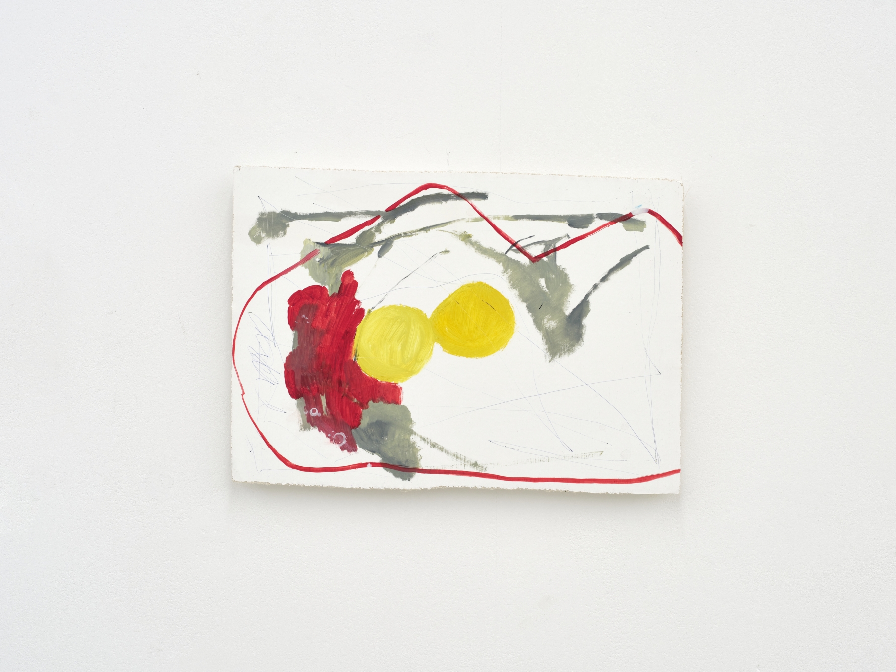
Another painting: at the centre is a wonky red rectangle, around which drift pale blue and yellow circlets, and from whose top protrude a couple more red forms, one loosely heart shaped. Squinting, you might start to see here an oversized vase and undersized flowers, so of course Choon has titled the work Black Puffer Jacket (2024). This might be a dramatically exaggerated version of a neurological truth. Seeing something in your mind’s eye is one thing, but if you were to paint a feeling about something, it wouldn’t look like that thing; it might look nothing like it, especially if you’re adding to that the fact that you hav- en’t seen it in a while, and are remembering it via the distorting scrim of, say, a note on your phone. But you’d be foolhardy, still, to think this is a painting of a memory of a feeling of a coat. Rather, between image and title, Choon wants to put you somewhere rich and unfamiliar, untagged, with lots of breathing space.
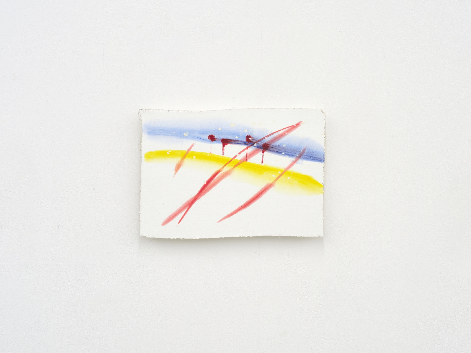
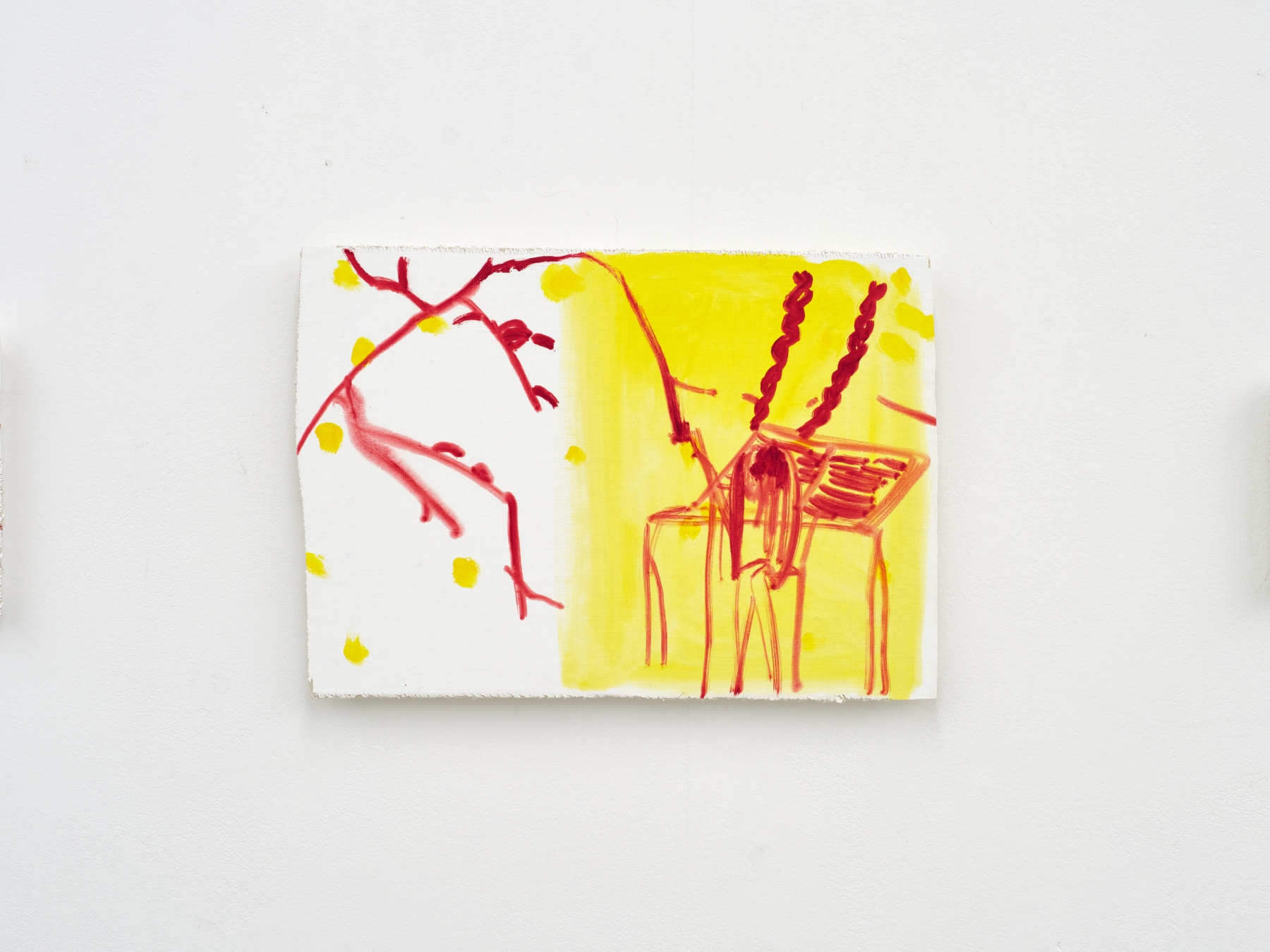
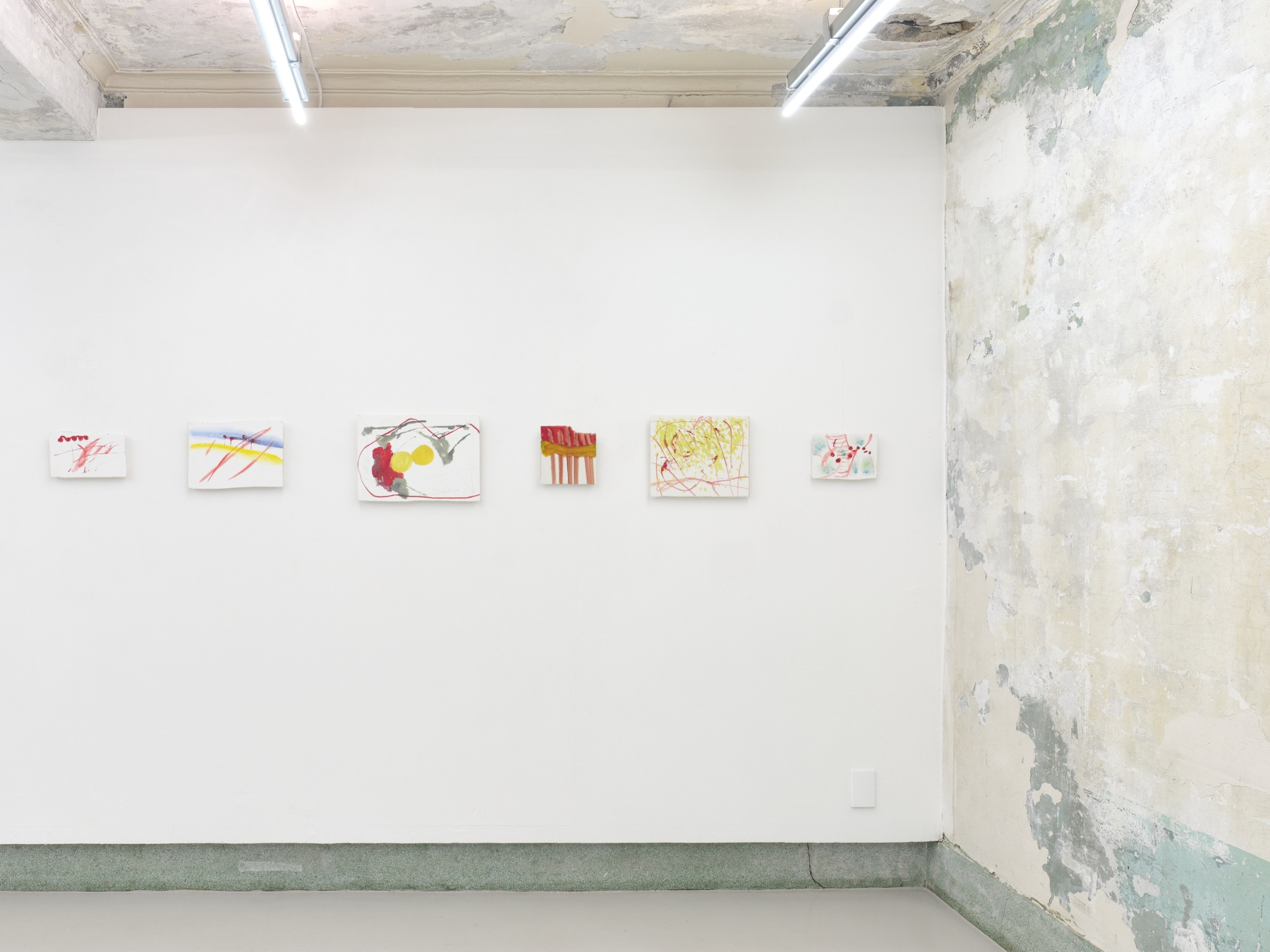
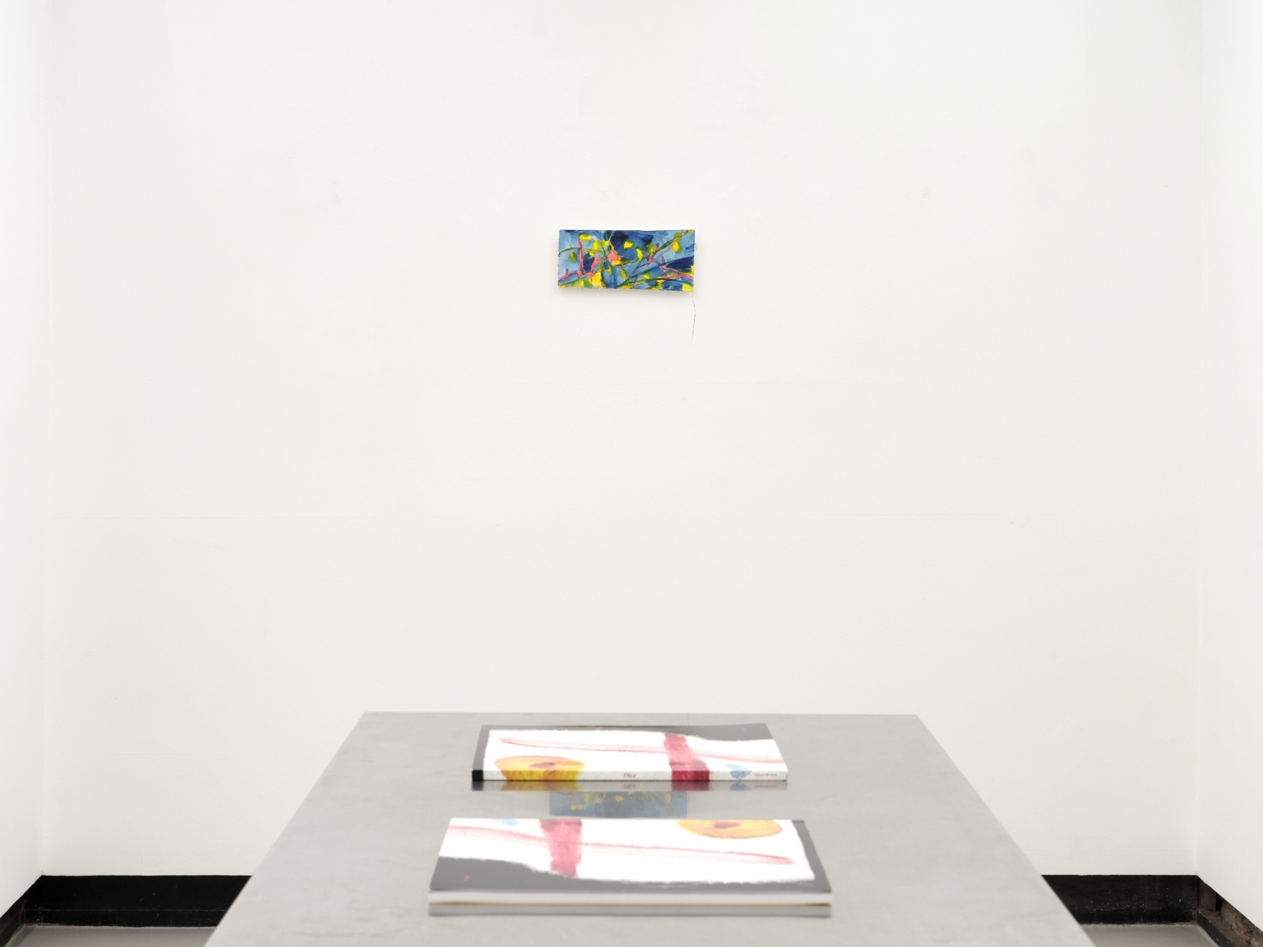
If that place could be found on a map, it might be somewhere between Korea, where Kim spent much of her earlier life, and the United Kingdom, where she went to art school. Under the UK’s overcast skies, Kim gravitates towards primary colours – strident tones we’ve perhaps forgotten how to deal with, if we ever knew. There’s something a little pointedly awkward about them, which goes, too, for Kim’s ges- turality. In Sky with Hands (2024), implicit markers of landscape – a maybe snow- or star-dappled blue sky, a horizontal-diagonal stroke that could stand for a cornfield, some crimson lollipop trees – are undone by four reddish, slimline strokes running the other way, as if bloodily countering the prettiness underneath. And yet, at the same time, both aspects of the painting kind of fit each other and cohere. It’s place and abstraction, east and west, painting and drawing, sketchy and finished, small and large, statement and not. If you start to see a sky here, you probably won’t find any hands. What might we call this, if anything, if we don’t want to just feel momentarily freed of bounding definitions? That’s up to the beholder; that’s Kim’s sideways gift to you.
Postscript: When I wrote this text, I wasn’t aware that Kim had employed chance procedures in her titling, shuffling
and assigning them randomly to individual paintings (hence the book title’s allusion to the unpredictability of dice-
play). This seems a perfect way of diminishing the authority of language over image with- out resorting to ‘Untitled’,
and extends the viewer’s participation: it creates a gap between painting and text that each of us will find our own
way to travel through.Martin Herbert is an art critic based in Berlin and an editor at ArtReview. His books include The Uncertainty Principle (2014), Tell Them I Said No (2016) and Unfold This Moment (2020). His writing has appeared in art journals including Artforum, frieze and Mousse, and in catalogues for, among others, MoMA, the Hayward Gal- lery and the Venice Biennale.